How To Create This Space
My last clients were such a pleasure to work with and it definitely helps when our styles align. We created this calming neutral palette in her hard surfaces that will stand the test of time and if she chooses, can bring in pops of color in her decor.

The design in this great room focused around two things, the fireplace and the view to their amazing pool. We wanted to keep the windows as large as possible without breaking the bank and create repetition and balance in the room.
We flanked the fireplace with these beautiful floating shelves custom built by Custom Finish Cabinets in Hurricane Utah. My client wanted open shelving for display and they also add dimension to the room. The mix of closed and open storage the perfect key to "form meeting function."

We went back and forth when deciding to take the fireplace tile to the ceiling, it would have brought the eye up to the beautiful vaulted ceiling detail in their floor plan but sometimes when you build, as we all know, you have to pick and choose where you want to spend your money and what is most important to you.

For the walls we used Sherwin Williams Agreeable Gray which is one of my go-to colors. This is the perfect "greige" but you don't want to use it if your color scheme is too warm as it will look really gray next to warm colors. Sometimes I will have Sherwin Williams mix this 50% lighter for a whiter overall look and its simply stunning! I rarely use un-colored whites on walls.


On the fireplace we used an Arctic White Ledger Panel 6X24 Non Grouted Tile that we purchased from Carpets Plus Design in St George Utah and used left over granite from the kitchen on the Hearth for that polished look. The shiny and matte textures next to each other add some interest.

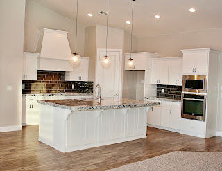
We grounded the room with this beautiful Bedrosians Riverwood Taupe 8X36 hardwood tile in the main areas and the carpet is Phenix Touchstone Color Grayson.

The view to the living room was finished off with these Vaxcel seeded glass mini pendants purchased from Wilkinsons Lighting in St George (ask for Sydney ;)
Overall, this neutral, relaxing, bright, and beautiful space was created as the perfect palette for decorating and I hope my clients love this space as much as I do!

At the Virtual Voyage Indore, which is one of the top interior designing institutes in India providing various interior design courses, the areas that will be focused under these interior designing courses will be residential design, commercial design, sustainable and ecological design and exhibition design.
ReplyDelete